Thursday, 23 January 2014

New brief + research on George Grosz

 
We have recently started a new brief for a 6 week project called "1% inspiration", where we had to choose a theme to work on. The five avalible subjects were: collections, boundaries, city, domestic, book makeover. I decided to work on boundaries, focusing on the more symbolic meaning, looking at social, as well as personal boundaries and exploring their meaning.
To start off, I looked at a German-American artist, George Grosz (1893-1959), who was a draughtsman and a painter. Although he joined the army for a short period of time, he'd spend most of the war in Berlin making ati-war drawings and paintings, also attacking the social corruption of Germany. He played an important role in the Dada movement.


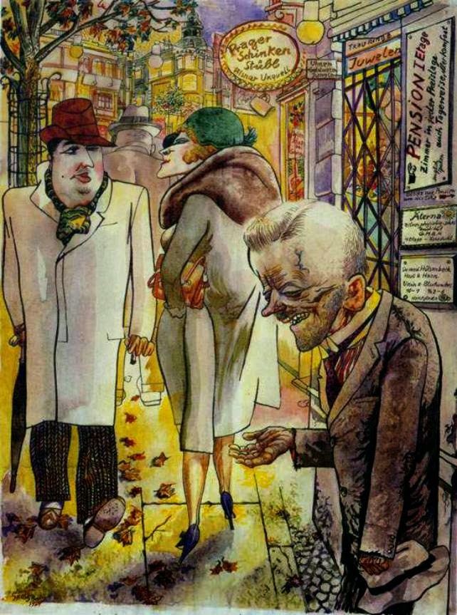


http://www.tate.org.uk/art/artists/george-grosz-1223

Thursday, 16 January 2014

Online Portfolio

I have just created an online portfolio on carbonmade.com and started to upload some of my work.
The link is here if you would like to check it out


Thursday, 9 January 2014

PDF files


PDF stands for Portable Document Format and is a very useful format that can be used to share files with people who don't have the same software or use a different platform. It will keep the file's original look (including fonts, colours etc.) on multiple computer systems.
The main software used to open and view PDF files is Adobe Acrobat Reader.
 
"When you use PDF files to communicate, you don't have to worry about whether people have the same software you used to create your originals. So you're free to focus on what matters most — the smooth exchange of ideas and information." - information from adobe.com


Thursday, 12 December 2013

Final piece


 Final Piece Making

For my final piece I decided to use two baby pictures of me and my brother to represent old memories. I had two pieces of wooden card, that were slightly bigger than A3 format. I painted them with white acrylic paint to have a clear background.
 
 
At first, the ink I used for the outline didn't come out strong enough on the painted background, so I had to work in layers. Luckily, the ink would dry quite fast, so I didn't have to wait long before applying another layer.

 
At the end, I also added some red acrylic here and there to make the ink a little darker.
Just like in one of my previous studies, I wanted to make the portrait look quite deformed, with a lot of marks and dripping paint, to represent an old memory that is slowly being destroyed/decaying, as well as link to my artist research.
 
 
When the ink was dry I started to draw some patterns with charcoal, trying to apply it in a way that will make the red ink stand out more. I used more on the right side, to indicate shading and create contrast with the left side that has much more white. I also went over some of the charcoal with black ink for stronger contrast.
 
 
For the second piece I used the picture of my brother. I wanted to use a different color ink this time, to indicate that it is a different person. Blue is a cold color, so it shoud create some contrast with warm red.

 
I repeated the process like before, adding layers of ink and acrylic paint.


Finished pieces will be mounted onto the wall this week.


Sketches

 
(...)

Dawn Mellor

 
Dawn Mellor
 
(Born 1970 in Manchester, currently lives in London)
Through her work, Dawn Mellor deconstructs the structure of the cult of celebrities, as in the modern world it appears that it is a substitute to religion. She often chooses a well know celebrity and portrays them in a quite disturbing way, also adding the theme of religion – e.g. by putting a halo above the celebrity’s head. This is meant to present how in today’s society we worship well-known figures based on how they are represented by media. They tell us what we should look like, what to wear, how to behave.
Dawn’s paintings show a relationship between the star and their believer - the fan.